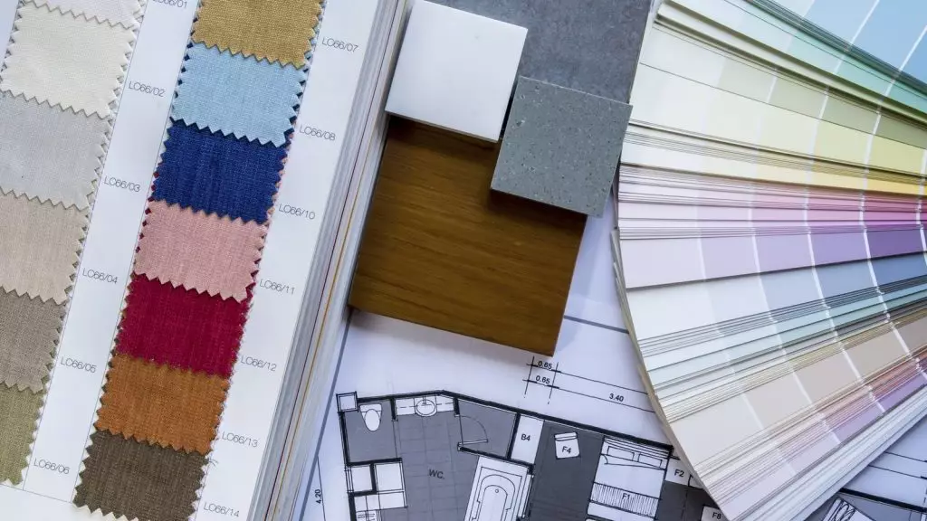
Interior design is an art form that melds an individual’s personality with their preferences, resulting in a meaningful expression of their inner self. Think of it as a blank canvas, waiting to be adorned with colors and enriched by the subtleties of woodwork, ceramics, and glass. Our task is to harmoniously blend these elements, creating a natural and coherent flow within both residential and commercial spaces.
While creativity is at the heart of interior design, we must also consider the impact of color schemes. Why? Because the occupants—whether clients, friends, family, or colleagues—will inhabit these spaces for hours. Therefore, understanding the psychology of colors becomes essential. The hues we choose can influence mood, productivity, and overall well-being. So, let’s paint those walls with intention!
Color Psychology is a fascinating field that explores how different colors impact our mood, cognitive functions, creativity, and productivity. Let’s delve into the intriguing world of hues:
Calming Blues and Greens:
Energetic Reds and Vibrant Tones:
Neutral Colors for Serenity:
Remember, while color psychology provides general insights, individual responses can vary. So, whether you’re choosing wall paint or designing a logo, consider the impact of colors on your well-being!
Let’s explore 10 common colors used in interior design and their psychological effects on the human mind:
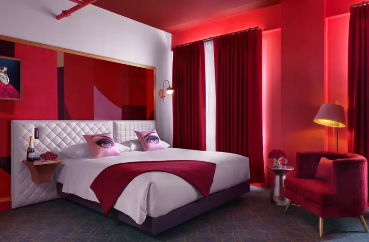
The color red is the most vibrant hue, representing emotions in their entirety. Whether it’s deep shades like maroon or lighter hues of crimson, red creates an atmosphere of love and camaraderie. Incorporating red into your design plans adds excitement and vigor to the entire room.
You can use red in various settings:
!Red color in interior design
However, red also evokes feelings of anger and revenge. To balance these intense emotions, consider combining red with calming color tones such as white or beige. You can add subtle nuances of red to stimulate productivity, but ensure a harmonious balance.
For instance, try using red on one or opposite walls in the bedroom while maintaining calm and subdued tones throughout the room. This approach instigates passion while keeping blood pressure levels in check. Complement red with colors like yellow, light green, or plain white.
Emotions Associated with the Color Red:
Feel inspired to design with the theme of “Red Velvet Monochromatic Living.”
A lighter and softer deviation from red, brown boasts a natural hue and a reassuring essence. It works wonders in vast spaces, harmonizing different elements of modernism and classic design.
Remember that the color brown is best used sparingly. As interior designers, ensure that wall colors, room colors, and the overall interior color scheme create a warm and comfortable atmosphere for the inhabitants. Your chosen color palette should also inspire them. While brown tends to relax the senses—perhaps a little too much, leading to inactivity and a lack of goals—it can symbolize resilience and security when combined with vibrant shades and other natural hues.
!Brown color in interior design
In interior design, brown is abundant when aiming for a rustic look and somber ambiance. Although elegant, this color has a tendency to evoke feelings of depression. To counterbalance this, consider pairing brown with cheerful colors like yellow, white, red, green, or orange.
Emotions Associated with the Color Brown:
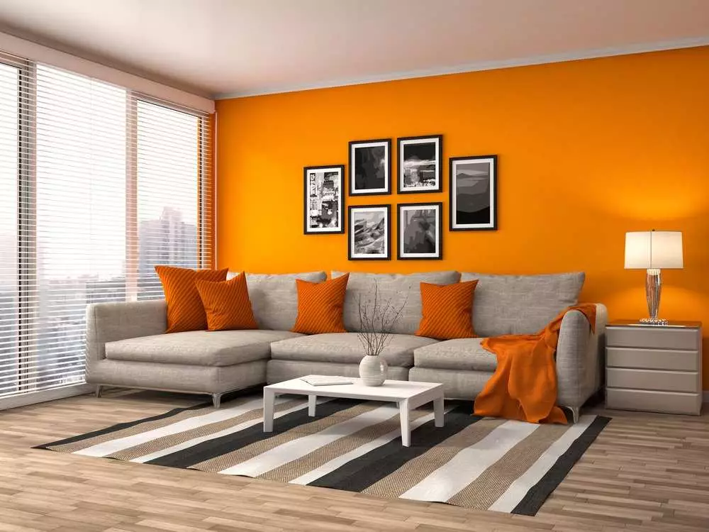
Another prominently vibrant color is orange. It symbolizes sunshine and nature. All shades of orange have a positive effect on the psyche. Distant tones of orange, such as gold, represent wealth and prosperity. Orange can reflect either the client’s personality or their desire for success and fame.
Similar to red, orange also inspires desire, love, sexuality, and appetite. This color predominantly has a calming effect on the senses, evoking memories of lying on the beach and sipping tropical beverages.
!Orange color in interior design
Orange is typically best used in bedrooms with complementary tints that tone down its extreme effects. It can also be effective in exercise areas to stimulate people.
Given its appetite-enhancing quality, orange is well-suited for both indoor and outdoor kitchen spaces.
For instance, consider using natural and neutral shades on the walls for a calming effect. Then introduce hanging lamps with orange patterns or incorporate orange chairs and cushions to tie the room together.
Emotions Associated with the Color Orange:
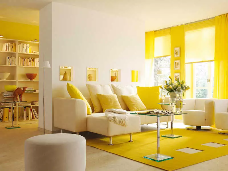
The color yellow is synonymous with sunshine, spreading the effects of light and happiness. It is also associated with intellect and prosperity, owing to its close connection with the color gold.
In interior design, yellow is recommended for kitchens, dining areas, hallways, and bathrooms. This color automatically uplifts people’s spirits, making the room feel bright and sunny.
!Yellow color in interior design
While most shades of yellow have a positive effect on the psyche, dull yellow colors can evoke feelings of doom, decay, and sickness. It’s best to use bright shades of yellow throughout the house. However, exercise caution, as yellow tends to stimulate uncontrollable emotions. A completely yellow room can even raise blood pressure due to its extreme optimistic effect. The brain associates high blood pressure with feelings of anger, potentially causing people to lose their temper without provocation.
Yellow also adds sophistication to interior design, especially when paired with grey or white. Yellow stucco walls with grey linings and patterns gained popularity in the 90s and are now making a comeback with better-quality materials.
Emotions Associated with the Color Yellow:
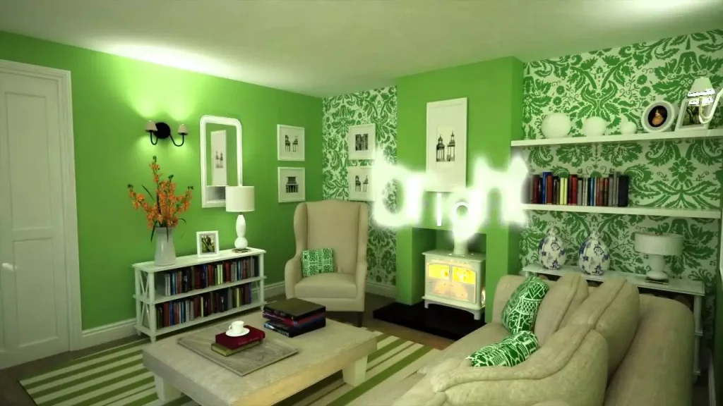
When people see the color green, they think of nature. Although in reality, nature can be cruel, the human psyche associates green with freshness, peace, and trust. Thus, green is a powerful color in interior design. Additionally, pale green is promptly associated with the color of pea soup, which is comfort food. It helps relax the senses and lower levels of hypertension and blood pressure.
!Green color in interior design
Green is an extremely versatile color. Different shades of green evoke different emotions. While light and aqua green have a calming effect, dark green is mostly associated with greed and jealousy. Olive green, on the other hand, is recognized worldwide for peace and harmony.
Green can be used in various shades throughout the house. Consider using lighter shades on the walls and creating contrast with dark green through plants. The effect of the dark shade is neutralized as plants automatically remind people of nature. Overall, green has a calming effect and imparts a sense of security, making it an ideal color for interior design.
Emotions Associated with the Color Green:
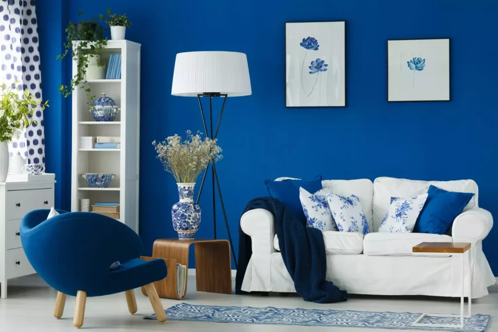
Blue is among the most calming colors in the interior design palette. In terms of psychological effects, blue relaxes the mind and slows down heart rate, metabolism, blood pressure, and hypertension.
Particularly, aquatic shades of blue—such as sky blue and light blue—have a healing effect on the mind. They remind inhabitants of the sea or swimming pools. Blue is unique in that it has an array of positive effects and minimal negative impact on the psyche.
!Blue color in interior design
You can use different shades of blue throughout the house. For instance:
Be cautious when using blue in dark rooms with small spaces, as it can create an eerie feeling akin to being trapped in ice. To counterbalance this effect, add warm colors.
Most dark blue shades are associated with elegance, luxury, and royalty. Sapphire colors add prominence to your design plan. Additionally, blue lights are easy on the eyes, reducing discomfort. Overall, blue is an excellent color scheme that complements modern and contemporary interior design trends.
Emotions Associated with the Color Blue:
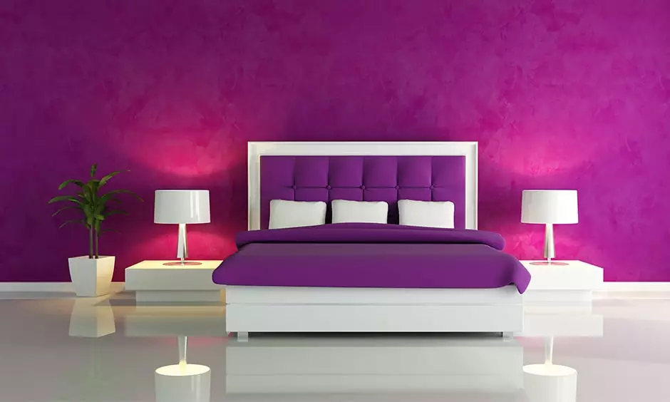
The color purple is usually associated with elegance and royalty. Purple color schemes work well in areas that inspire creativity and design. Bright hues of purple, such as violet or plum, add flair to your design scheme. Meanwhile, lighter shades of purple, like lavender and mauve, create a calm yet regal effect in your design.
!Purple color in interior design
Since purple inspires creativity, consider incorporating it into dressing rooms, walk-in closets, in-house art studios, or even the kitchen. This color is particularly popular with adolescent teens, as it encourages them toward creative and performing arts, helping them find their path.
The regal quality of purple also works well in the foyer or living room, where your guests spend time. It imparts an essence of calm, elegance, and luxury.
Emotions Associated with the Color Purple:
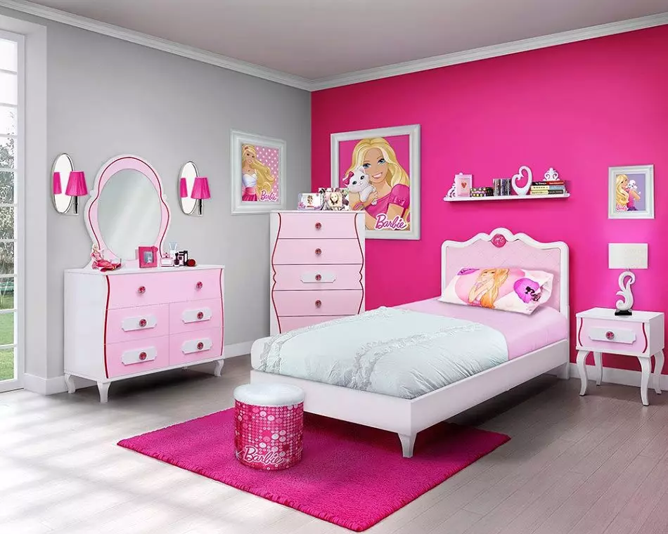
The color pink influences emotions that are closer to the heart. When used appropriately, pink and all its shades create an atmosphere of love and compassion.
Although pink is largely associated with femininity, it can also be used to achieve a masculine effect. Simple patterns and sophisticated designs elevate pink to a whole new level in modern interior design trends. It instigates feelings of comfort and love. Vibrant shades of pink, such as magenta and fuchsia, make a statement when paired with secondary colors like light blue. Use them to bring out the playfulness of wall patterns.
!Pink interior design
Complement pink with natural hues or vibrant tones of red and white for balance. This prevents any sentiments of loss or excessive sweetness. Pink works well in teenage girls’ rooms, as well as in living rooms and bathrooms, creating an atmosphere of joy and bliss.
Emotions Associated with the Color Pink:
The color black has always fared well in terms of versatility and elegance. It signifies simplicity and functionality. Black works best in modern interior design and architecture.
From a psychological perspective, an all-black room can be overwhelming and gloomy. However, when paired with red, white, blue, or almost any other color, it provides excellent contrast.
!Black interior design
Contrary to popular belief, black is an excellent addition to interior design, especially in the kitchen, living room, dining area, and bathroom. With this color scheme, form follows function, accommodating simplistic design trends.
Emotions Associated with the Color Black:

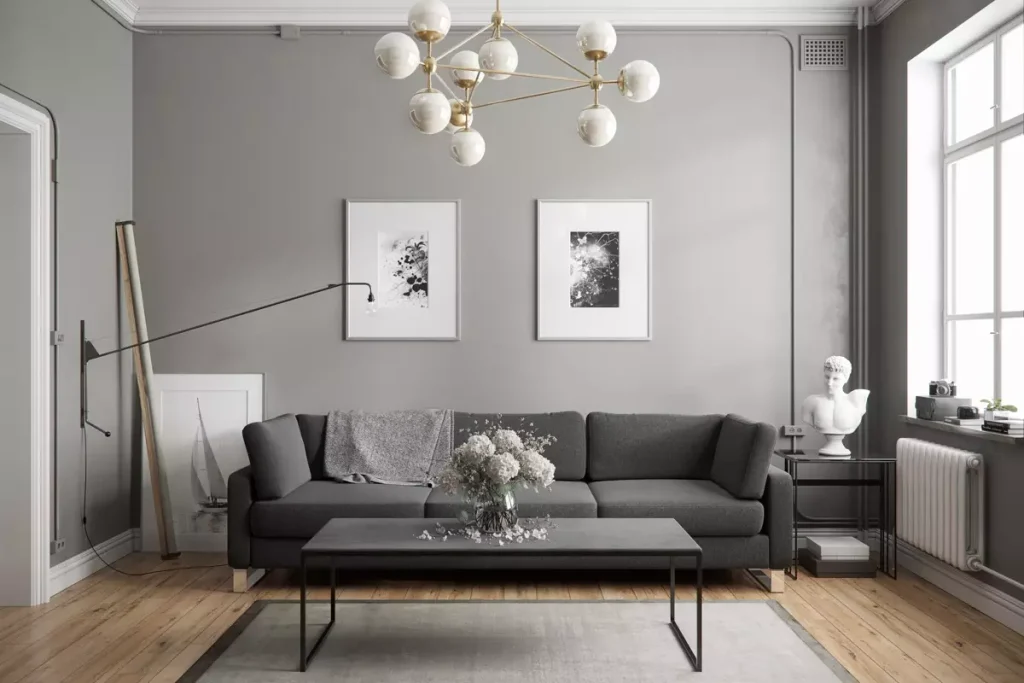
The color gray is another neutral hue highly associated with elegance and style. While there is some controversy regarding its effects on the human mind, when used correctly, gray can have a positive impact.
Although some people find gray depressing, it can serve as a neutralizer for vibrant color schemes. Avoid using light gray on walls, but consider using dark gray on one wall and surrounding it with cheerful colors like white, yellow, or pink. Incorporating gray into furniture within a bright room adds elegance and sophistication to your design plan.
!Gray interior design
In reality, gray evokes different feelings in different individuals. Various shades of gray can have a calming effect on some, while others may associate it with depression. When using gray, it’s safer to incorporate it through textiles rather than wall colors. If you choose gray as the dominant room color, ensure ample natural light to create a welcoming and warm ambiance.
Emotions Associated with the Color Gray:
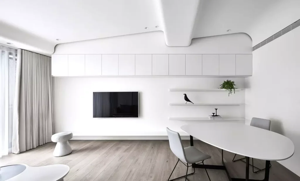
The color white is a universal neutralizer. Although all colors of the spectrum essentially emerge into white, in interior design, white serves as a powerful color scheme.
There are different shades of white, such as ivory (widely used as a standard wall color), eggshell, and many more. Beige combines well with white, creating a versatile palette.
!White interior design
White is associated with peace and tranquility. It’s why spa facilities, Japanese architecture, and Scandinavian cultures use white abundantly. White represents cleanliness and makes it easy to spot any marks or dirt on surfaces.
White also serves as a blank canvas for implementing all your design ideas. On a psychological level, a white color scheme benefits people with claustrophobia (fear of closed spaces). Implementing white makes rooms appear larger and cleaner. It also works well for individuals with anxiety and hypertension—the calming effect helps control heart rate and blood pressure.
White symbolizes simplistic living, minimizing disturbances from extremes and excitement. You can use white in any part of the house: bedroom, bathroom, kitchen, living room, dining area, or throughout the property. It visually expands space and reduces tension.
Pair white with other colors for vibrant effects:
Emotions Associated with the Color White:
لورم ایپسوم متن ساختگی با تولید سادگی نامفهوم از صنعت چاپ و با استفاده از طراحان گرافیک است چاپگرها و متون بلکه روزنامه و مجله در ستون و سطرآنچنان که لازم است